By Nancy Rausman
SYNOPSIS
If you’re not mobile-friendly, you’re losing your audience. Upgrade your practice web site to make it work well on all sized screens.
ACTION POINTS
MAKE WEB SITE FOR BOTH COMPUTER & MOBILE. Use “responsive design” to create a web site with pages that automatically adjust to any size screen.
OR BUILD SITE ESPECIALLY FOR MOBILE DEVICES. Use “mobile design” to create a smaller, separate version of your practice web site especially for mobile devices.
CONSIDER IMPACT ON SEO. A smaller version of your site that uses a different URL than your full-size practice web site may negatively impact search engine optimization.
A practice web site must be easily accessed and read on a smartphone or tablet, as easily as on a laptop computer. There are two ways to do this: “responsive design” vs. “mobile design.” Responsive design means the pages of the web site automatically adjust to whatever size screen the site visitor is using, while mobile design means creation of a separate web site, especially for mobile devices.
Whatever path you choose, ensure patients have the ability to easily access your practice web site from a mobile device. The statistics for mobile search just keep climbing. According to EyeCarePro data, in December 2013, optometry web sites saw a rise in mobile traffic to 33.12 percent, up nearly 6 percent from the previous month. Of that traffic, mobile phones increased by 6.5 percent to 25.19 percent and tablet usage increased 4 percent to nearly 8 percent of overall traffic. Additionally, Google has come out and stated that web sites that are not optimized (made accessible for mobile devices) will be penalized in search engine rankings.

An example of responsive design in which one web site automatically adjusts to any screen size–whether on a desktop or laptop computer or on a smartphone or tablet.
Design Web Site for Both Computer and Mobile
Responsive design is a flexible way of building a web site, enabling it to scale the web page to the size of the computer screen or device being used to view the page. You have one URL that works equally well from a desktop browser and a mobile browser. Among the benefits of responsive design are that it saves time (and money) from a coding perspective since the same HTML code can be used for all versions as opposed to a mobile version of a web site which often requires writing entirely new code.
Responsive design is often included in the price of a web site since it is just a matter of how the web site is coded. More and more web site designs these days are being programmed with responsive design.
If you already have a web site that is was not responsively designed, it will probably be about four to eight hours of work to convert it. The cost of this largely depends on how much your web designer/web company charges per hour or if they have a flat rate to convert a site to responsive design. At EyeCarePro, our design team charges $75/hour for custom design/programming.
Here are two examples of EyeCarePro clients with responsive web site design. As you can see, these are virtually indistinguishable from the desktop version of the web site:
www.drmvickers.com
www.mississaugavisioncentre.com
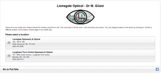
An example of a mobile web site in which a separate web site was set up especially for use on mobile devices.
Or build site specifically for mobile devices
The other option is to build a special mobile web site, which is basically a smaller version of the web site designed to fit on the mobile screen, often eliminating many of the slower loading elements on the page to make it load faster. The mobile web site is usually stripped down to the most functional, mobile-friendly elements of the web site such as address, hours, contact information, services, doctor information, etc… It usually has a similar, but a different URL to the main site such as mobile.dreyesight.com or m.dreyesight.com.
A separate mobile web site could have a number of costs. If your web company will be designing the site from scratch you may have to pay for custom design hours. If, however, there is a template site, such as what we offer with ODMobile, you may only have to pay set up and a monthly hosting fee, which, in our case, is $18.95/month.
Here are two examples of EyeCarePro client mobile sites. These sites are stripped down to the essential details that will be most likely sought after by someone searching from a mobile device. Notice that there is an option right on the homepage that will direct a user to the full web site for more information.
www.lionsgateoptical.com/m
www.lakelinevision.com/m
Understanding the Terms
There are two options for creating a web site that is user-friendly on all devices, laptop and desktop computer, as well as mobile devices like tablets and smartphones:
“Responsive Web Design”
A web site in which the pages automatically adjust to whatever size screen the site visitor is using.
“Mobile Design”
Development of a separate web site, especially for mobile devices.
Consider Impact on SEO
To maximize web traffic to your new site, you may want to opt for responsive design. From an SEO perspective, the issue with the mobile web site option is that once you introduce a new URL for the mobile web site, if not set up correctly, you run the risk of your two sites appearing as completely separate, unrelated web sites. If your mobile traffic isn’t connected to your main web site, neither site will get the full weight or “credit” of the traffic coming in to boost the site ranking. In other words, it might hurt your web site ranking and visibility if the two sites appear unrelated to Google. Matt Cutts, head of Google’s webspam team, says both options are proper for dealing with mobile traffic, and that Google has a lot of help documents available to webmasters to ensure they are doing things correctly. However, he notes that there is more room for error with mobile web site versions.
When in doubt, responsive design is the smarter option according to Cutts because you don’t risk losing any SEO benefits since you are using the same URL. Still, if the webmaster sets up the mobile web site according to Google’s instructions, there shouldn’t be any negative impact on SEO.
Unless you are extremely computer-savvy and understand coding techniques that you could research online, either approach to making your web site mobile should be outsourced. That said, the good news is, usually, we are not talking about steep costs. The most important thing is to make sure you speak to your web master/designer about the options and ensure that he or she really understands the issues to consider. Then you can work together to make the choice that best suits your practice.
The bottom line: Ensure your web site is optimized for mobile devices, whether you choose a mobile web site or responsive design.
Related ROB Articles
Make Your Web Site Mobile-Friendly
QR Codes: Your Mobile Marketing Tool
Five Great Apps to Help You Talk to Patients About Eye Health
Nancy Rausman is the managing editor at EyeCarePro. Nancy is responsible for providing ECPs with educational content that helps them advance their practices through technology, management strategies and digital marketing. EyeCarePro is one of the leading providers of online marketing and practice improvement services in the industry. EyeCarePro serves both industry and practices and is the only company of its kind solely focused on the optometric space. To contact: nancy@eyecarepro.net