By Nancy Rausman

June 1, 2016
SYNOPSIS
Is your practice web site ready to be viewed and easily used on smartphones and tablets? Today, it’s be mobile-ready or be invisible, as powerful search engines prioritize businesses that are.
ACTION POINTS
UPGRADE TO RESPONSIVE DESIGN. Responsive design means one single site that adapts to whatever screen it’s being viewed on. Adaptive design sites use separate layouts and designs which are loaded based on the screen size of the device.
INCREASE PAGE SPEED. Optimize and format your images for the mobile screen size and slower networks.
AVOID POP-UPS. Pop-up blocks with ads, or other information, are enough on a desktop, but even harder to tolerate when using a small screen, like that of a smartphone.
Today, more communications than ever are accessed on mobile devices. Optometric practices have to be mobile-ready.
At Least Half of Web Traffic Comes from Mobile Devices
With potentially 50 percent, or more, of traffic coming from mobile devices, it is essential for optometric web sites to be optimized for this mobile traffic by having a mobile-friendly web site. Mobile optimization means that your site looks and behaves optimally when viewed on a mobile device. Now, more than ever before, mobile optimization is integral to your site’s, and your practice’s, success.
4 Reasons Your Practice Web Site Must Be Mobile Friendly
1) Data shows that mobile web users have caught up to, if not exceeded, desktop search in optometry.
2) Google favors web sites that are mobile friendly for search visibility.
3) You will fall behind competitors if your site is not mobile-friendly.
4) You will lose mobile users (i.e. patients) who do end up on your site if it is not a good user experience.
Google Ranks Mobile-Friendly Sites Higher in Search Listings
In addition to ensuring that your web site is accessible and appealing to the mobile user experience, another reason that mobile optimization is essential for optometry web sites is that Google has made it an important factor in site ranking and online visibility. In response to the new mobile reality, Google has implemented algorithm updates to reward web sites that cater to this growing population of mobile searchers–and consequently marginalize those that don’t.
It began back in April 2015 when Google implemented a significant update to favor mobile-friendly web sites over those that were not mobile-optimized. Referred to as “Mobilegeddon,” this update was hyped up to be the last chance to update your web site to be mobile-friendly if you wanted to maintain visibility in Google search. The impact of this update was expected to be monumental, although some will say the results were less dramatic than expected.
In the meantime, a significant portion (more than half!) of the online OD population has still not updated their mobile strategy, giving those that do have mobile-friendly web sites an SEO advantage over their lagging competitors.
Well, those ODs who have still not gone mobile might face yet another wake-up call as Google has announced that throughout the month of May 2016 it will be strengthening this mobile-friendly ranking factor, giving even more preference to mobile-friendly sites. While the update is not expected to have results quite as extreme as “Mobilegeddon,” it does give web site owners even greater incentive to update their web sites if that have not already done so.
From the perspective of Google, the update is a natural response to the growing trend in mobile search. In an announcement on the Official Google Webmasters Blog from from March 16, 2016 entitled, “Continuing to make the web more mobile friendly,” Google representatives explained the update as follows:
“Getting good, relevant answers when you search shouldn’t depend on what device you’re using. You should get the best answer possible, whether you’re on a phone, desktop or tablet. Last year, we started using mobile-friendliness as a ranking signal on mobile searches. Today we’re announcing that beginning in May, we’ll start rolling out an update to mobile search results that increases the effect of the ranking signal to help our users find even more pages that are relevant and mobile-friendly.”
The post then reassured the public that web sites that are already mobile-friendly will not be impacted by the update and that sites that have high quality, relevant content still have a chance at ranking well even if they aren’t mobile friendly.
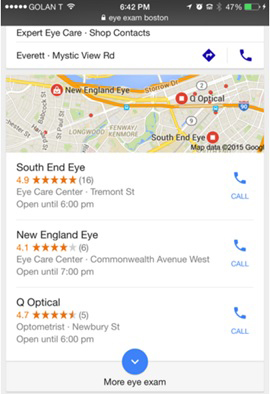
A screen shot of a mobile web search page which shows the call buttons and relevant mobile information (address, opening hours, services, etc.). Rausman says Google will place devices that are easy to use on mobile devices higher in the search listings than less mobile-friendly sites.
How to Make Your Web Site Mobile-Friendly
There are a few different options for going mobile with your web site, but most web masters agree that either an adaptive or responsive design is the best option (as opposed to a separate, standalone mobile web site with it’s own m.url).
Responsive Design
Responsive design adapts your web site layout to the device you are viewing from to provide an optimal viewing and user experience. Using techniques that include fluid, proportion-based grids and flexible images, responsive design uses one single site that changes based on the device that is accessing it. Responsive design is the most common (and recommended) design, particularly for new sites that are mobile-friendly from the start. Google itself recommends using a responsive design for mobile-friendliness.
Adaptive Design
Adaptive design sites use a number of separate layouts and designs which are loaded based on the screen size of the device, so the designer creates multiple options for common screen widths (the standard is 6, but some choose to create more or less). While this type of design can be time-intensive, adaptive sites are sometimes a better option for web sites that already exist, but want to reformat to a mobile-friendly design.
It is best to consult with an experienced web designer to decide which option is best for your practice web site’s needs.
Important Considerations in Going Mobile
Just having a responsive or adaptive web site design is not enough for Google to consider your web site “mobile-friendly.” Here are a few additional mobile-friendly factors to consider:
Increase Page Speed
Page speed is an important user experience issue for mobile users who are often on the run. To keep page speed optimized, you need to make sure your images are optimized and formatted for the smaller screen size and slower networks and to clean up your coding by reducing redirects and using browser caching (your web developer will know what this means).
Avoid Pop-Ups
Pop-ups not only slow your site speed, but they will annoy users who have to deal with closing them in order to access the information they want to see. Do your best to eliminate this unnecessary turn-off for site visitors.
Use Rich Snippets
Rich snippets are a way of tagging your practice location information (name, address and phone number, as well as reviews) so that Google can better understand your web site content. Adding rich snippets to your web site can improve your rankings and increase your visibility and notice-ability on mobile search results because they stand out and provide more information to users during a search. This provides a better mobile user experience and improves conversion rates of users clicking through to your site.
Local SEO
Local search optimization is even more important on mobile for a number of reasons. First of all, a mobile device shows fewer results, so it is even more important for your practice to show up at the top. Secondly, the results will display a link for the user to “click-to-call” directly to your practice from their mobile phone or a second button to click for directions. You want to make sure your site is optimized for these instantaneous conversions where a user has an immediate need and will call or drive to your location following the search.
Critical Features
When thinking about the design of your mobile page, consider the features that will successfully convert a mobile user. Your phone number, address and hours must be prominent on the home page. Click-to-call functionality, a map or a link to directions, as well as prominent buttons to schedule an appointment, should also be present.
For more information about how to optimize your optometry web site to be mobile-friendly, download this free e-book on Making the Most of Mobile.
If you are not sure whether your site is mobile-friendly, Google has provided a mobile friendly testing tool, as well as a mobile guidelines resource to help.
Remember, less than half of ECP web sites are currently mobile-friendly, which gives those that are a leg up on the competition. If your practice web site is still only built to be seen on a desktop computer, you are losing traffic to web sites that can seen on any smartphone, tablet, laptop or desktop. Even if you show up high in search (which Google is making harder and harder), the user experience you provide your potential patients and customers will pale in comparison to your competitor down the street whose web site is mobile-friendly. Users that are able to find your web site will quickly bounce your site and find the next OD web site that will accommodate them.
If your practice web site still isn’t mobile-friendly, what are you waiting for?
Nancy Rausman is the managing editor at EyeCarePro. Nancy is responsible for providing ECPs with educational content that helps them advance their practices through technology, management strategies and digital marketing. EyeCarePro is one of the leading providers of online marketing and practice improvement services in the industry. EyeCarePro serves both industry and practices and is the only company of its kind solely focused on the optometric space. To contact: nancy@eyecarepro.net